Talking Tech: Out with Composite Forms and in with Dashboards
Meet the Author

Let’s Talk Tech.
Accordion’s “Talking Tech” series explores how different CFO Technology solutions can empower finance functions to support organizational strategic initiatives – by implementing business process recommendations, optimizing operations, and capitalizing on value creation opportunities.
Now, let’s take a look at how to leverage dashboards within Oracle.
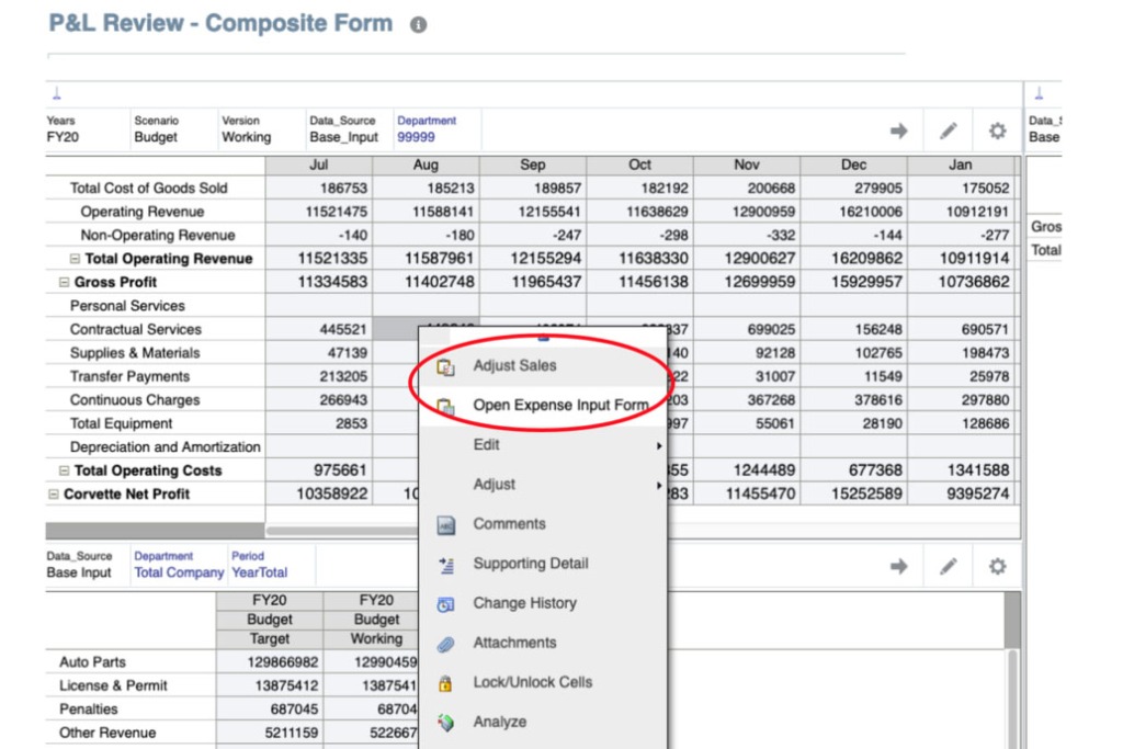
In Oracle’s Planning & Budgeting Cloud (PBCS), composite forms are those that contain two or more simple forms. Composite forms can allow users to view multiple input or review forms with different structures on the same screen, or in a tab format.
For some time, Oracle has talked about doing away with composite forms in favor of other methods of accomplishing similar goals. Well, that day is officially here. As of the April PBCS update, Oracle will be removing the ability to create new composite forms. Although all existing composite forms can still be edited and used, the ability to create new composite forms in your service will be lost.
With composite forms going away, you will need to leverage dashboards, and all the functionality they have to offer, to fill these needs. In this post, we break down what this change means to you – both pros and cons.
SO, WHAT EXACTLY IS A DASHBOARD?
Dashboards give an overview of key information, while letting planners change and save data, chart, evaluate, highlight, comment, and run rules. One of the greatest strengths of dashboards is the capability to change a driver in one place, then instantaneously see its impact in other forms and charts on the screen.
With dashboards, you can also:
- Include up to six simple forms
- Include up to 9 charts or tiles
- Choose chart types such as area, bar, bubble, column, combination bar and line, doughnut, funnel, gauge, scatter, radar, etc.
- Add external web page links
- Include commentary in the dashboard
- Design the dashboard’s layout and customize dashboard colors
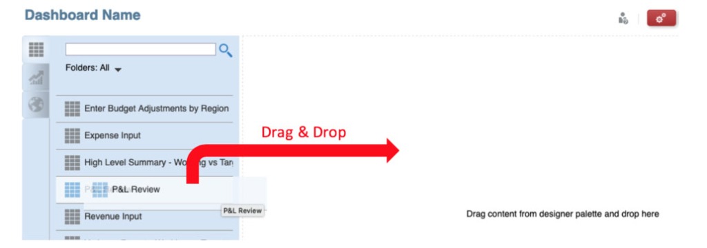
CREATING DASHBOARDS
Creating dashboards is a simple drag and drop of objects from the left design palette over to the canvas. Objects include simple forms, chart types, tile, commentary, and URL. Objects can be placed to the left, the right, the top, or the bottom of each other.
COMPOSITE FORMS VS. DASHBOARDS
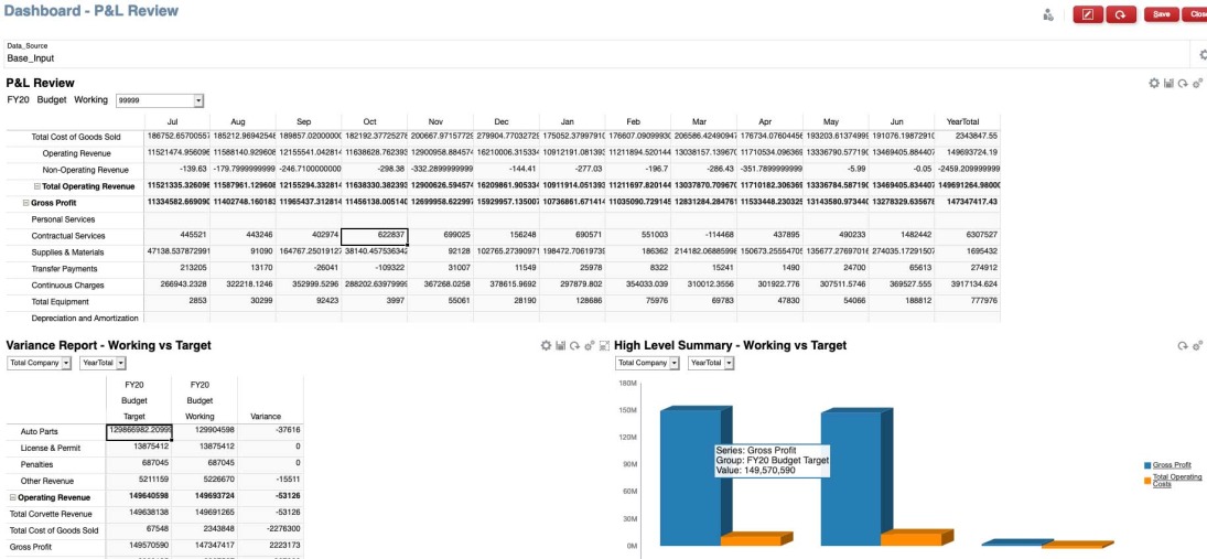
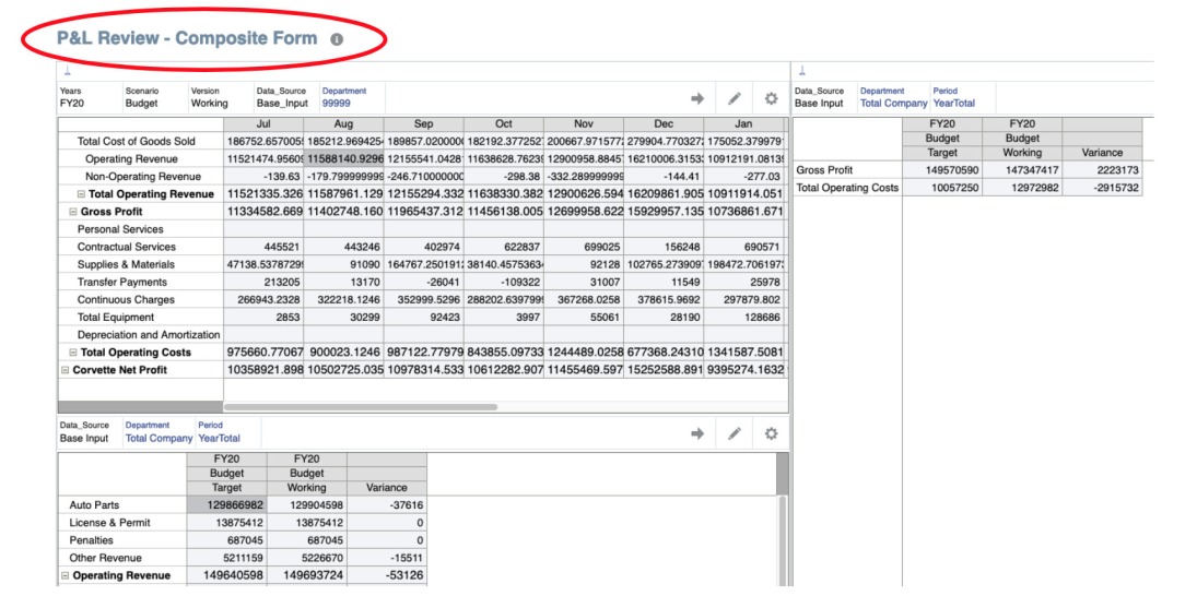
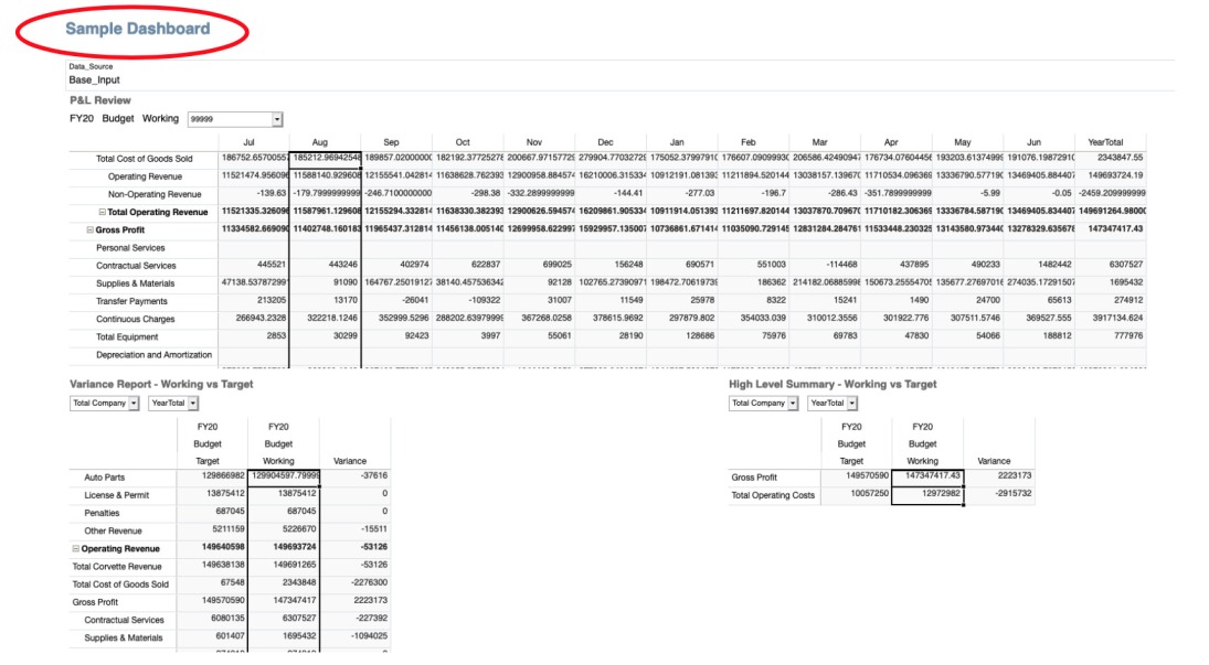
So, what is the difference between composite forms and dashboards? Well, aesthetic wise, you can create a dashboard that looks a lot like a comparable composite form. Below we display what a planning user would see when looking at a composite form and similar dashboard. Like forms, you can input data in dashboards and access them in SmartView, thanks to the December 2018 update. When you open a dashboard in SmartView, a new Excel workbook is launched with each dashboard object displayed in a separate worksheet. Chart objects are displayed in grid format. Please note that only grid and chart objects are supported – other dashboard objects are ignored when opening via SmartView.
Unfortunately, one useful capability that is lost with dashboards is the ability to create custom right-click menus that can take you directly to a different form, without having to first close the current one. On the other hand, you do still have the ability to use custom right click menus to launch business rules (phew). Additionally, you do lose the tab layout option that composite forms offer when viewing them via the web, but remember that dashboards do open in separate tabs when opened in SmartView.
On the upside, dashboards provide much more functionality in terms of graphically displaying data via charts, as well as embedding links or commentary. It is even possible to create charts that are drillable, which allow you to display high level data, then drill down into the details and update the chart in real time.
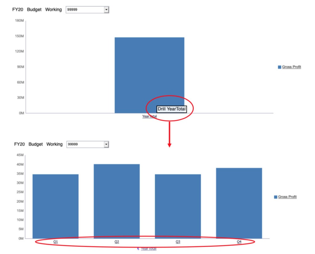
These dashboard features can help you to display information in a more meaningful way as an end user is going through their planning process.
KEEP CALM – DASHBOARDS CAN HOLD THEIR OWN
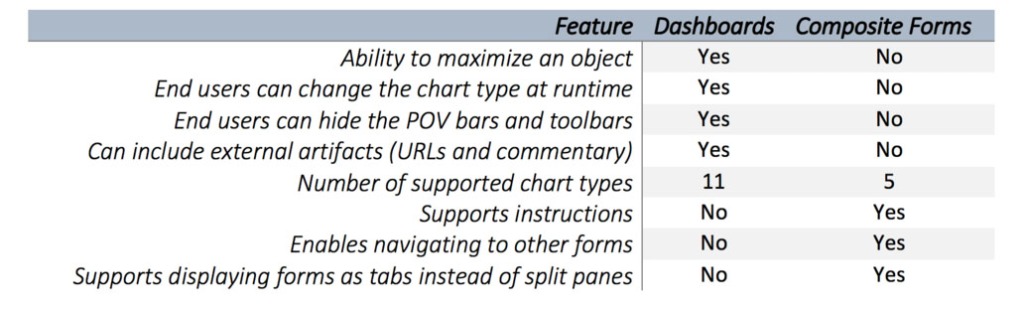
Overall, we don’t think this update disturbs much functionality to a planning user. Dashboards offer a wide selection of features that are worth reviewing. Check out the chart below for a few more comparisons between dashboards and composite forms. The full list can be found here.
Meet the Author